
Refreshing your bedroom for spring seems straightforward—the opportunity to lighten up, swap chilly textiles for airy fabrics, and invite a breath of seasonal change. But this seemingly simple refresh can easily go off track. The wrong choices around color, texture, scale, and layering turn what should be a calm, invigorating retreat into a chaotic or staged space that feels disconnected from daily life. Understanding common mistakes preparing for this seasonal change and correcting them rap- idly results in a bedroom that feels both fresh and effortless.
This article unpacks five frequent missteps in spring bedroom makeovers, with a precise fix for each. By focusing on architectural clarity, layering that respects materials, and deliberate focal points, you’ll get tools to sidestep clutter and visual confusion. Whether you’re working with a small city bedroom or a larger master, these corrections connect design theory to concrete, actionable styling.
Mistake 1: Overloading the Bed with Seasonal Accessories

One common trap in spring bedroom refreshes is treating your bed like a seasonal display. Overstuffed pillows, multiple throw blankets, or erratic layering can quickly tip a bedroom toward feeling busy rather than serene. The bed is typically the room’s centerpiece, and excessive accessories disrupt the clean lines and visual calm.
The fix is decidedly less-is-more: Choose one or two textural accents that relate to your main bedding palette, like a linen throw in soft earth tones and one accent pillow with a subtle pattern. Opt for natural materials—washed cotton, linen, or subtle wool blends—that breathe with the season. Maintain a balance in scale by avoiding too many small throws or bulky pillows. Keep the color story tight, using a limited spring bedroom refresh color palette of dusty clay, muted greens, and off-white.
Apply this by clearing all unnecessary layers and assessing length, thickness, and color of the throw blanket. Layer only what highlights the bed’s architecture and enhances its presence rather than obscures it. This reduces visual noise and makes your bed feel like a composed focal element, not a decorative afterthought.
Mistake 2: Mismatched Spring Colors That Clash Instead of Cohere

Another frequent misstep is introducing spring’s fresh color palette without cohesion—resulting in a bedroom where colors compete rather than complement. Vivid pastels paired haphazardly with bright hues or overly muted tones create imbalance.
The solution is to build a controlled color story. Start with a foundational neutral such as a matte plaster-like taupe or soft warm gray for walls. Layer in spring colors through textiles and accessories using a restrained palette: sage green, soft terracotta, and cream. Avoid bright, saturated colors; instead, choose muted versions that harmonize with the neutrals.
To implement this, choose one larger element like curtains or a rug to introduce a color and coordinate all smaller accents around it—throw pillows, a bedside lamp, or a small piece of art. Using colors in giving weight to larger surfaces first ensures the palette reads as intentional rather than accidental.
Mistake 3: Neglecting Texture Consistency Across Touchpoints
Texture is a subtle but powerful player in spring bedroom refresh ideas. A common oversight is introducing fabrics and surfaces that don’t converse visually or tactilely—a slick satin with rough linen, or shiny metal lamps beside matte plaster walls, causing disjointed layering.
The fix is to orchestrate a cohesive texture story focused on materials that align in finish and feel. Spring invites soft matte finishes and natural fibers: washed linens, unpolished woods, raw ceramics. Mix these in varying scales—coarse linen cushions balanced by smooth cotton sheets, plaster walls offset by warm wood furniture—to create gentle contrast but avoid visual conflict.
Try grouping similar textures within zones: bedding and soft furnishings can share matte, woven characteristics, while metal or glass accessories remain minimal and curated. This strategy deepens the space’s rhythm and tactility without discord.
Mistake 4: Overlooking Proportion and Furniture Placement for Light Flow
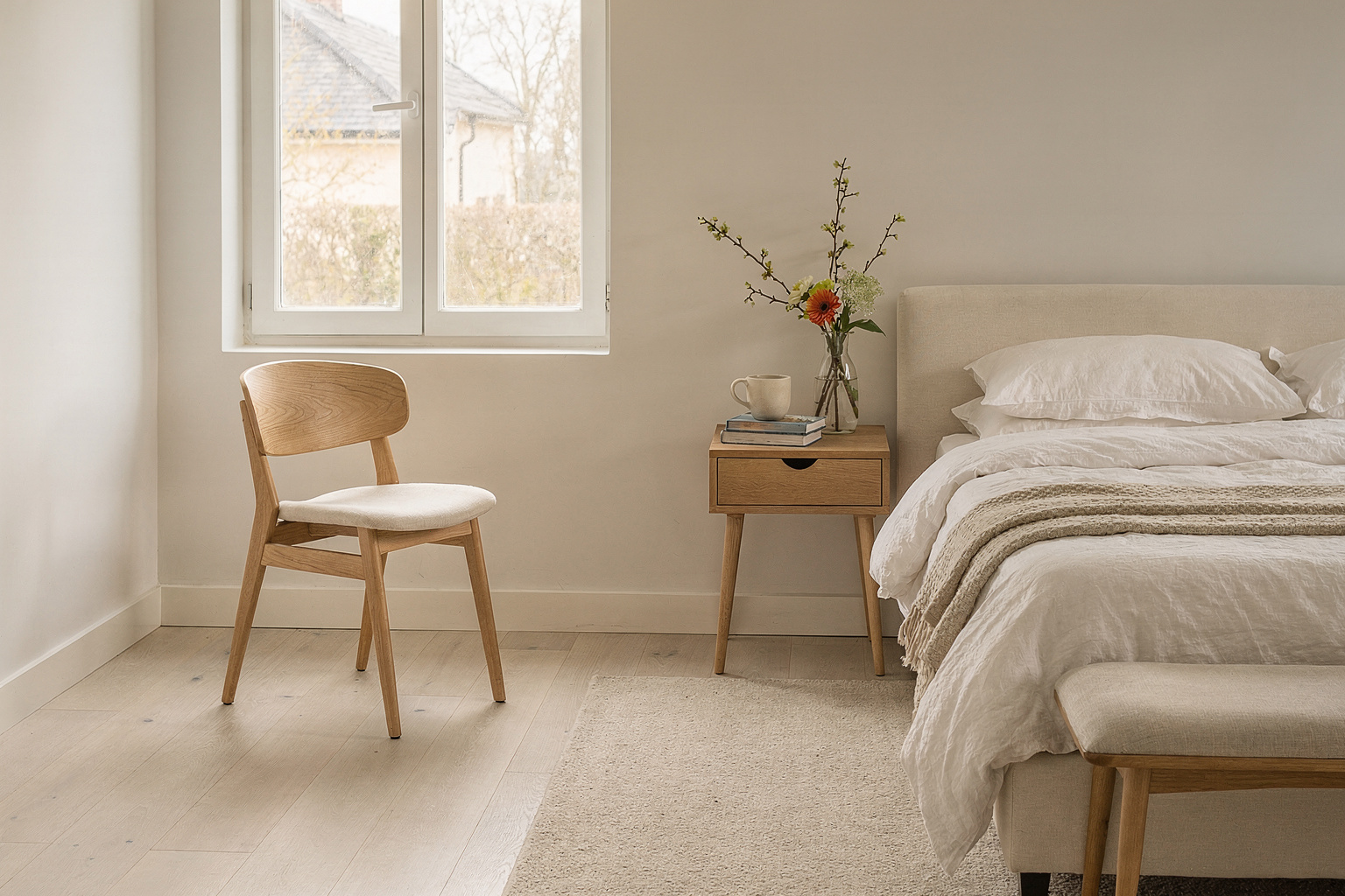
In spring bedroom updates, rearranging or adding pieces can hinder natural light flow and disrupt scale relationships, which undermines the airy, fresh feel spring decor aims for. Oversized furniture too close to windows or tight groupings in a small room block sightlines and reduce spatial ease.
The corrective move is strategic furniture placement with an eye for proportion and daylight. Keep bulkier pieces like wardrobes or chests opposite windows or walls away from natural light sources. Low-profile beds framed by simple bedside tables help open visual pathways. Consider furniture legs that lift visually off the floor, emphasizing spatial flow.
A practical step in application is to measure walking paths and daylight arcs before the refresh. Experiment with minimal repositioning: angle a chair toward natural light or pull back side tables slightly. This cultivates a bedroom that feels more spacious and welcoming without costly or bulky additions.
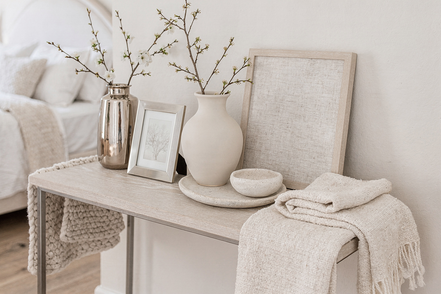
Mistake 5: Excessive Decor Cluttering the Final Composition

The final—and most impactful—mistake is assembling a spring bedroom that feels over-styled. Too many small decor pieces or accessories disrupt the sense of calm and visual hierarchy essential in a restful bedroom.
Correct this by editing aggressively: keep only those objects that serve a clear function or enhance the room’s main aesthetic. Focus on layering with simple matte finishes, a restrained palette, and a handful of statement textures. For example, replace multiple small vases with one medium ceramic piece or consolidate personal items in a single decorative tray.
This editorial restraint allows the architecture, materials, and curated accents to breathe and hold attention naturally. The result is a bedroom refresh that feels thoughtful and collected—comfort rooted in material presence, not visual noise.
Frequently Asked Questions
How can I update my spring bedroom on a budget without making mistakes?
Focus on textiles first—swap bedding and add a well-chosen throw or pillow in your spring palette. Avoid buying lots of small accessories which clutter the room.
What color palette suits a spring bedroom refresh without overwhelming the space?
Choose muted naturals and soft earthy pastels like sage, clay, cream, and warm grays rather than too-bright colors. Keep the palette limited to 3 or 4 complementary hues.
How do I maintain a cohesive texture story in a bedroom?
Stick to natural fibers and matte finishes. Combine linen, cotton, plaster-like walls, and warm wood. Avoid mixing shiny and rough textures that compete.
How important is furniture placement in freshening a spring bedroom?
Very important. Proper placement maximizes natural light and maintains scale. Keep pathways clear and avoid blocking windows with bulky pieces.
What’s the best way to avoid over-cluttering during my refresh?
Edit decor with purpose. Use a few signature pieces rather than many small items. Prioritize function and visual weight in selections.
Conclusively, the spring bedroom refresh is an opportunity to enhance what already works, with attention to scale, texture, and restraint playing vital roles. Avoid common mistakes by refining your color palette, layering thoughtfully, editing accessories, and minding furniture proportion and placement. Start with these foundational corrections to create a space that feels genuinely relaxed and composed for the season ahead.