Japandi style melds the clean minimalism of Japanese design with the warm functionality of Scandinavian aesthetics, especially in the bedroom. But achieving that perfect balance of simplicity and cozy texture can be surprisingly tricky. Without careful attention, textures can either be too flat and cold or too heavy and layered, undermining Japandi’s core appeal: a calm, lived-in yet serene space that invites rest.
Many people new to Japandi bedrooms wrestle with texture choices — whether it’s mixing materials that don’t quite gel, or overlayering fabrics in a way that disrupts visual flow. Getting texture right matters here more than in many other styles because this look depends so heavily on subtle contrasts and tactile harmony.
This guide focuses on common texture mistakes in Japandi bedrooms and practical ways to fix them. You’ll leave with clear ideas about why certain textures work together, how to balance tactile warmth with sleek surfaces, and what color and material pairings create that gentle visual rhythm essential to Japandi bedrooms.
Overly Smooth Surfaces That Flatten the Room
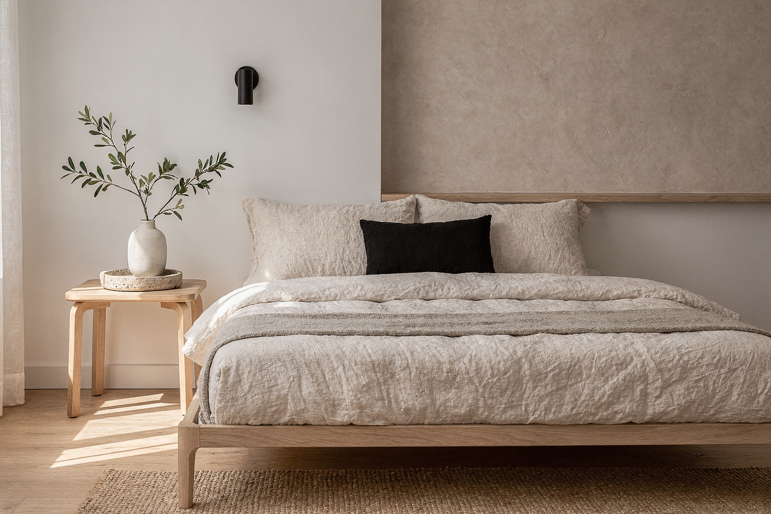
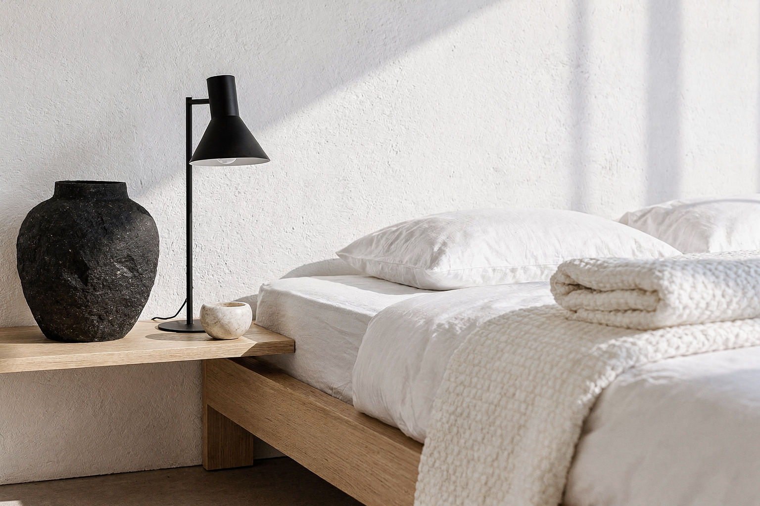
A classic mistake is relying too much on polished woods, smooth stone, or sleek furniture without balancing in soft tactile textiles. While Japandi aesthetics do favor simplicity and clean lines, a bedroom with only hard, flat surfaces quickly feels cold and uncomfortable. Linen bedding, woven throws, or a wool rug introduce just enough texture to invite touch and soften the space.
Why this works visually: The contrast between smooth and tactile creates a gentle interplay of light and shadow, which naturally warms the room’s visual temperature. It also prevents the space from feeling sterile by adding inviting layers.
Practical tips: Start with a base like unbleached linen sheets or a cotton duvet cover with subtle slubs (small irregularities in weave). Add a chunky knit or woven throw in neutral tones like taupe, soft gray, or warm cream. Incorporate a rug with low but visible texture fiber—avoid plush shag to keep with Japandi restraint.
Mixing Textures without Considering Weight or Warmth
Sometimes layering textures doesn’t mean layering warmth or balance. For example, combining heavy, dark woods with brittle or shiny textiles can throw off the relaxed harmony. The heaviness of the wood competes against the fragile fabric, pulling attention and mood in different directions.
Why this matters: Japandi thrives on soft contrasts and cohesion. Unbalanced texture weights cause visual tension, disrupting the restfulness crucial to bedrooms.
How to fix it: Swap overly dense wood furniture for lighter wood tones or pieces with less surface shine. Match fabric textures with similar warmth—soft cottons and linens align with lighter woods, while heavier velvet or dense wool pairs better with darker furniture. Use natural finishes like matte or lightly oiled wood rather than glossy styles.
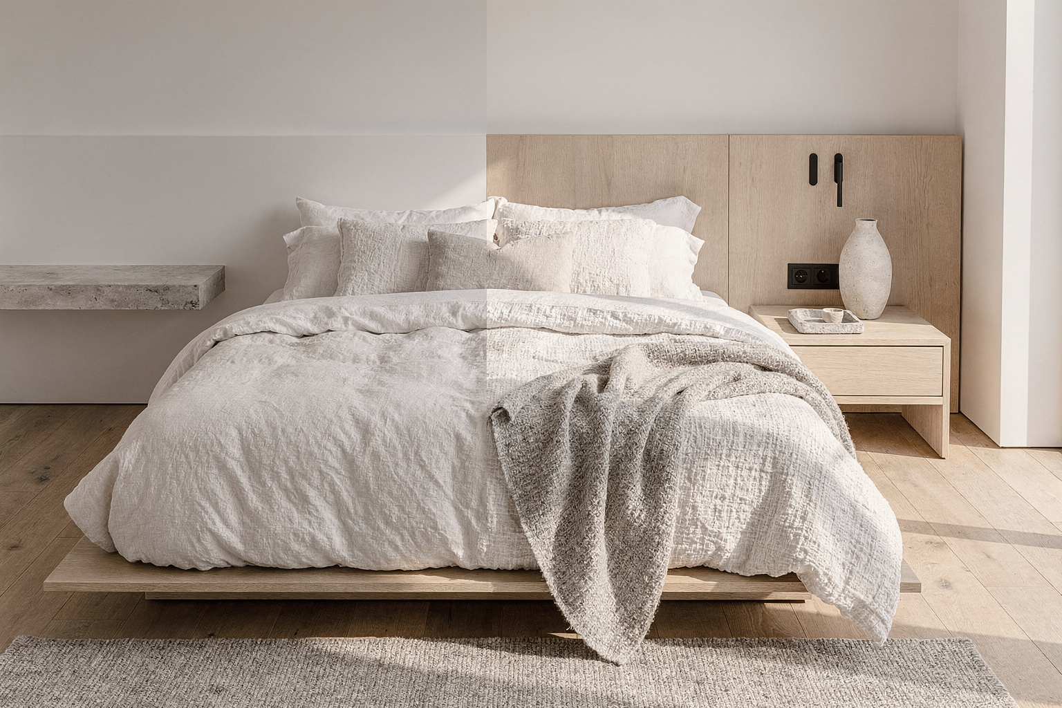
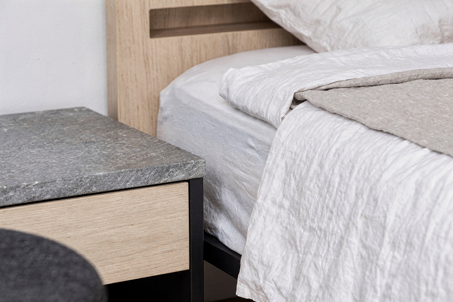
Ignoring Subtle Textural Harmony Between Layers
A mistake less obvious but impactful is mixing textures that clash subtly but noticeably. For example, pairing a glossy lacquer bedside table with a rough wool blanket and sleek cotton sheets can fragment the room’s flow. The tactile cues send mixed signals, leaving your eye unsettled rather than soothed.
Why this disrupts the look: Japandi relies on a quiet dialogue between texture layers, where each element complements the others in scale and finish. Forced combinations prevent rooms from feeling fluid or thoughtful.
Step-by-step solution: Choose texture families that share qualities—natural fibers, matte finishes, or organic patterns. For example, if you have a raw wood bed frame, balance it with lightly textured linen bedding and a soft, low-pile jute rug. Avoid adding high-gloss or overly patterned surfaces that compete visually.
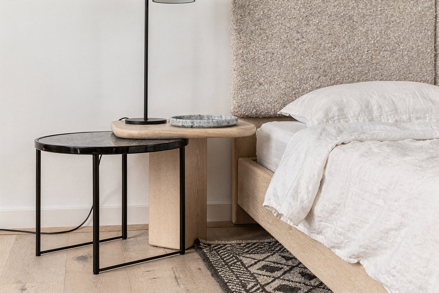
Overlooking Texture Proportion Relative to Room Size and Light
Many underestimate how texture scale influences spaciousness and light flow. Large, chunky textures or rough stone details, while beautiful, can feel overwhelming in smaller Japandi bedrooms or rooms with limited natural light.
Why texture proportion is key: Overly large or heavy textures absorb light and visually crowd the space, undercutting Japandi’s airy, light-filled ideals.
How to adjust: For smaller rooms, choose fine-gauge textiles like thin linen or smooth cotton with a subtle weave pattern. Keep stone or ceramic elements small or opt for lighter-colored, matte finishes. Position tactile elements near natural light sources to enhance their softness and transparency rather than concentrate dense textures in shaded corner spots.
Layering Too Many Contradictory Textures That Overwhelm Calmness

The final mistake that most disrupts Japandi bedrooms is overlayering disparate textures so the space feels cluttered rather than collected. Overplaying texture can turn your peaceful retreat into a visual jumble where softness is lost under busy surfaces.
Why restraint works better: Japandi’s beauty lies in selective layering—each texture earns its place and builds a quiet narrative of comfort.
How to correct layering: Edit textiles and materials carefully, limiting the number to 3-4 essential layers. For instance, combine a wooden slatted headboard, cotton bedding, a linen throw, and a jute rug. Avoid adding extra cushions, blankets, or furniture with conflicting materials if those don’t harmonize visually or texturally. This mindful restraint helps each texture breathe and contribute to quiet warmth.
FAQ
How can I tell if my textures clash too much in a Japandi bedroom?
If textures feel jarring or you notice your eye hopping from one surface to another without rest, it’s likely a clash. Step back and assess finishes—look for contrast in sheen, scale, or material weight that feels harsh rather than balanced.
What colors support better texture layering in Japandi bedrooms?
Neutral, earthy palettes work best—think warm grays, soft beiges, off-whites, and muted wood tones. These colors provide a calm backdrop that lets textures show subtly without overwhelming the space.
Is it okay to add a patterned textile in a Japandi bedroom?
Yes, but keep patterns minimal and subtle. Opt for natural fibers with simple weaves or low-contrast patterns like fine stripes or small geometrics that don’t fight with the overall calm tone.
How do I refresh textures seasonally in a Japandi bedroom?
Swap a chunky knit throw for a lightweight linen one in warmer months, or add a soft wool rug for winter. Keep your base colors neutral so these textural shifts feel seamless.
Should I prioritize natural or synthetic textures in Japandi rooms?
Natural textures are key to Japandi warmth—linen, cotton, wool, wood, stone. Synthetic materials tend to feel colder or less authentic, which can spoil the lived-in look.
Balancing textures in a Japandi bedroom needn’t be complicated, but it does call for thoughtful choices. Avoid these common pitfalls by listening closely to how your materials speak to each other: too much polish without softness flattens the room; mismatched texture weights and finishes cause visual tension; ignoring proportion or light dims warmth; and overlayering turns calm into clutter. Begin by editing layers carefully, favoring natural, tactile textiles and warm woods. With a bit of attention to subtle detail, your Japandi bedroom will reward you with quiet comfort and timeless style.