Bathrooms often promise a spa-like sanctuary, but too often, surface styling falls short, muddling the room’s calm potential. From cluttered countertops to conflicting material choices, these everyday styling mistakes quickly undermine a bathroom’s quiet architecture. Surface decor is one of the most visible and tactile elements in these compact spaces. When executed poorly, it throws off the room’s balance, ruins flow, and risks the feeling of a rushed, chaotic setup.
This guide targets one core issue: what goes wrong when we don’t plan bathroom surface styling thoughtfully and how to fix it. With refined mistakes and fixes focused on material coordination, scale, and layering, you’ll learn practical bathroom finishing touch ideas that respect the space without oversimplifying it. Whether styling a small powder room or a generous master bath, the details you control here shape the entire experience.
Overloading Surfaces With Mismatched Decor
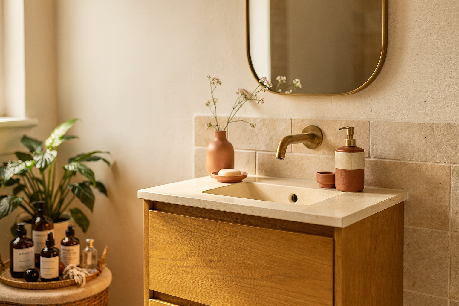
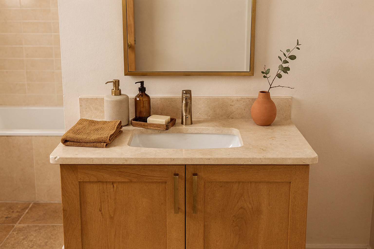
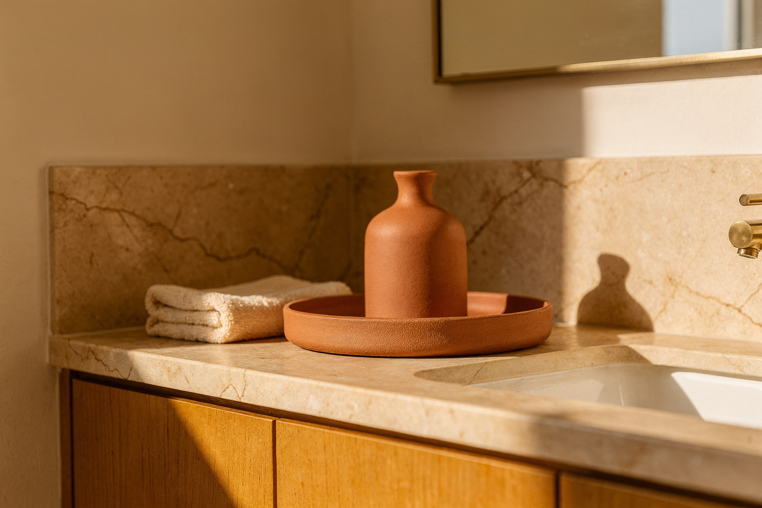
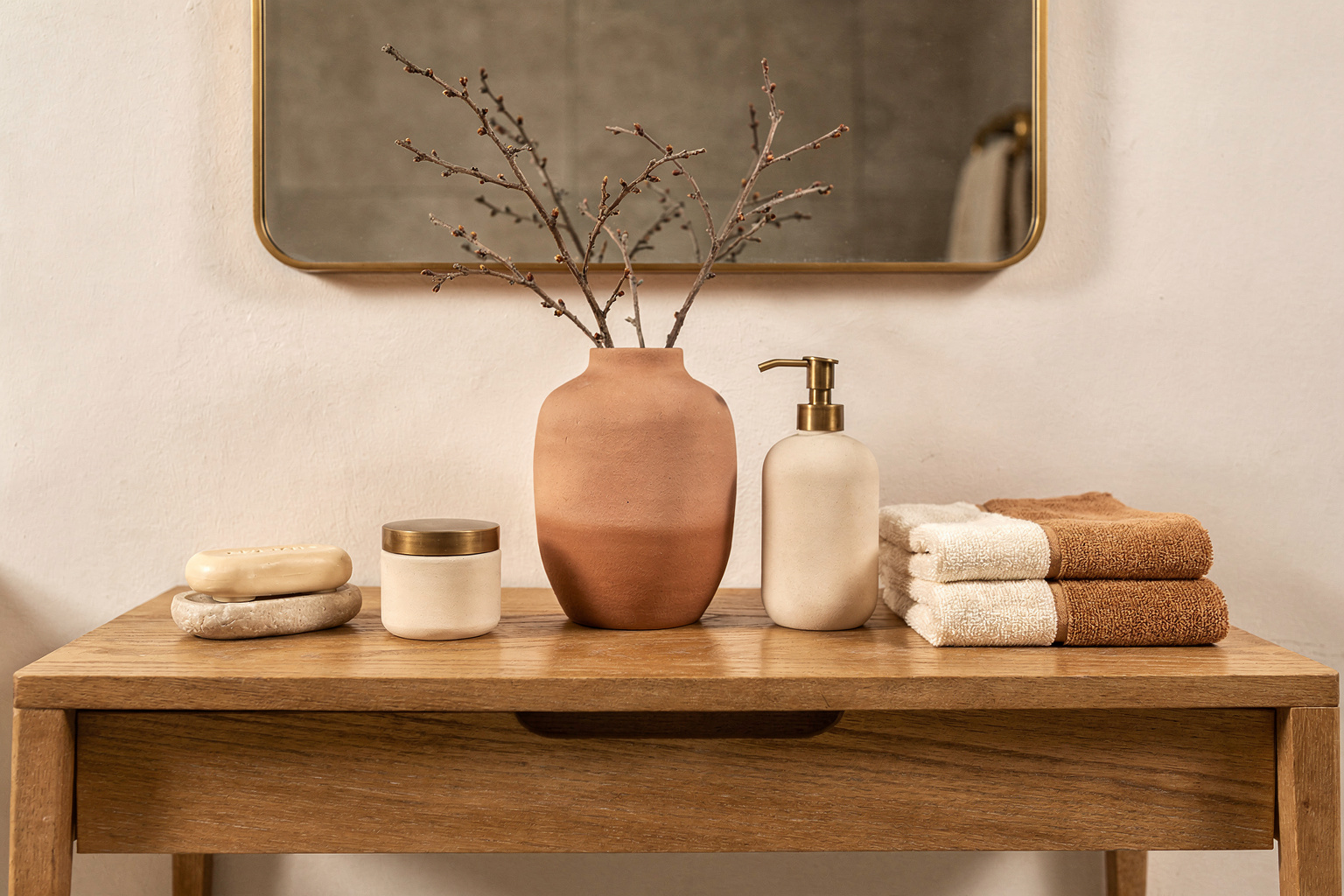
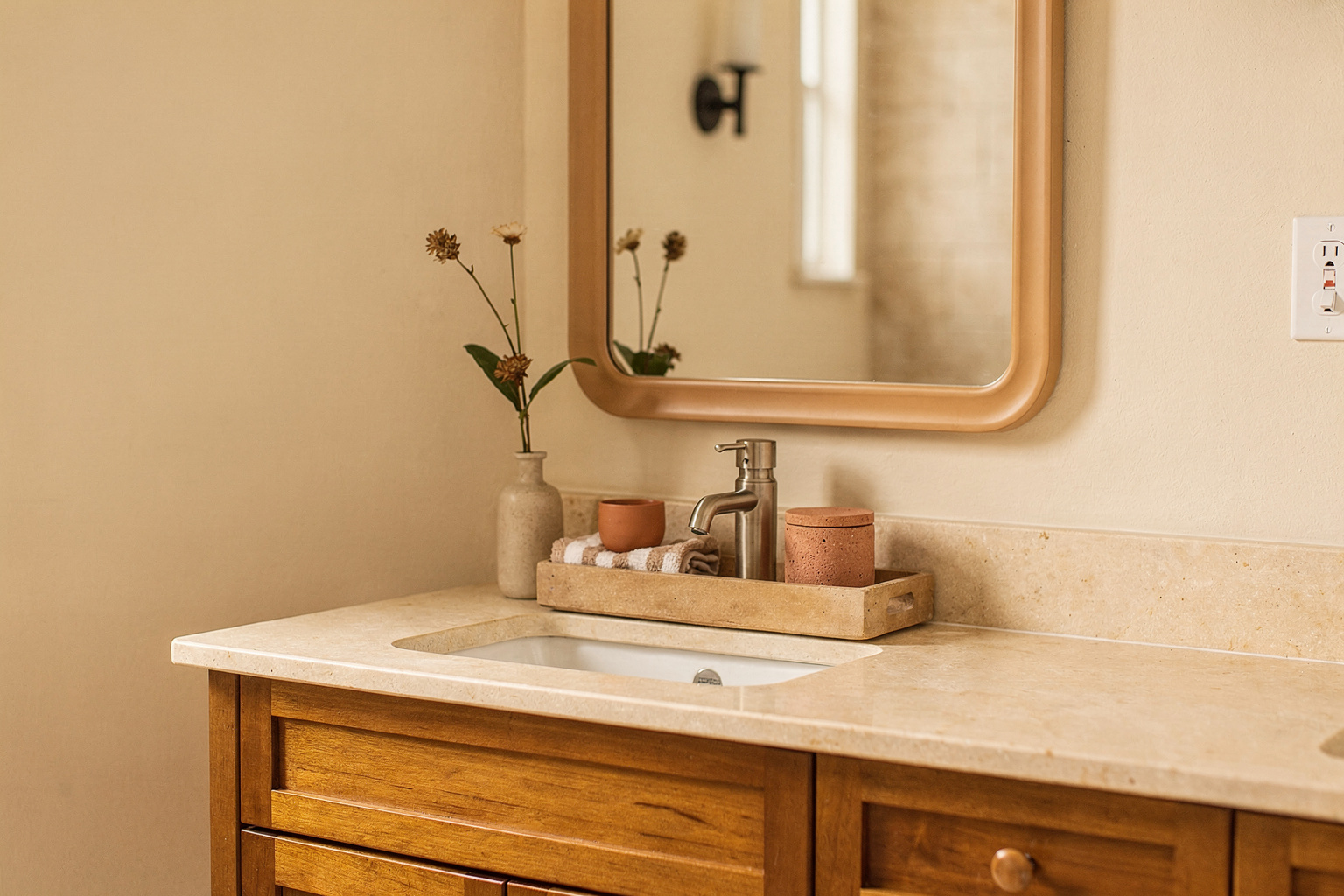
A common misstep is treating bathroom surfaces like catchalls, layering many uncoordinated objects without hierarchy. This creates visual noise and detracts from the architectural lines and materials that deserve attention. Think of your surfaces as a gallery display—not a storage shelf. Limiting the number of items with a clear focal point maintains clarity.
The fix: prioritize essential everyday items, then add one or two sculptural accents to amplify texture and interest. Use trays or shallow wood boxes that unify smaller objects visually. Matte metals, like brushed brass or blackened steel, pair beautifully with warm wood or smooth plaster without competing.
For example, on a white quartz countertop, a small raw wood tray containing a matte ceramic soap dispenser and a folded linen towel adds warmth and neatness. This grouping contrasts against sleek stone surfaces without excess clutter. Keeping color accents neutral—soft greys, warm whites—helps sustain calm and avoids visual congestion.
Ignoring Material Consistency With Surfaces and Backdrops
Another mistake that disrupts bathroom harmony is mixing too many clashing surface materials without a mindful relationship. A dated laminate countertop paired with glossy subway tiles and shiny chrome fixtures rarely reads as cohesive. The mix of reflections and textures can feel chaotic and unrefined.
A well-considered palette of two or three complementary materials chosen for their surface properties—matte, raw, or polished—rests better visually. For instance, a matte plaster wall behind a solid wood countertop softened with a honed stone sink foundation works with industrial black metal hardware. Each element contrasts but belongs to the same material family, forming a curated composition.
Practical advice: aim to repeat materials or finishes in subtle ways across the room to knit surfaces together. If you have a concrete-look floor, bringing in matching plaster walls or raw wood accents generates harmony. Avoid accidental collisions of shiny, reflective, and textured surfaces within the same visual plane.
Breaking Visual Flow with Inconsistent Tile and Countertop Choices
Many bathrooms lose their sensory flow by abruptly switching tile patterns or countertop textures mid-range, which rattles spatial perception. For example, jumping from small mosaic tiles to an aggressively patterned marble countertop can feel disconnected and overload the eye.
Fix this by choosing tiles and countertops that share scale and tonal qualities or transition gently through placement. Use larger-format tiles with subtle color shifts under a quiet, matte countertop surface. Where pattern is welcome, confine tiles to splash zones or niche areas rather than the entire vanity backdrop.
When picking countertop and tile, consider the room’s light and size. Subdued, mid-tone materials prevent harsh contrasts that make the room feel chopped into fragments. Instead, aim for smooth gradations or paired textures with limited color variance.
Disregarding Scale and Proportion in Surface Accessories
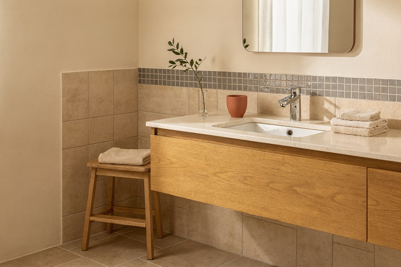
Small bathrooms often suffer from oversized or too many surface accessories. Large candleholders or bulky jars can dominate a vanity, making the space feel cramped and awkward. Conversely, excessively tiny items disappear and clutter the eye.
The rule: scale your surface accessories relative to available tabletop space—generally avoiding more than two to three pieces per surface area. Incorporate objects with tactile contrast but restrained volume, like a low matte ceramic vase or a slim wooden box.
Additionally, layer heights modestly with no item higher than the lower bathroom mirror edge to preserve line of sight. Group items with thoughtful spacing—allowing breathing room between—that connects visually with vertical proportions of mirrors and lighting.
This control of scale works practically by maintaining ease of use and cleaning, so your surfaces remain functional and visually composed.
Overlooking Finishing Details That Anchor a Styled Bathroom Counter
The final mistake often lies in skimping on finishing surface details that tie everything together—soft textiles, small plants, or subtle color ties. A countertop can look sterile without elements that introduce softness, life, or warmth.
A simple folded towel in a natural fiber or a sprig of green provides quiet contrast to hard surfaces. Matte finishes on soap dispensers or containers also prevent glare and contribute to tactile layering.
Pay attention to color echoes, too—match towel hues with small decor accents or the undertones of countertop stone for a subtle but powerful effect. This technique grounds the visual composition, turning a staged setup into a lived-in vignette.
These finishing touches communicate care and complete the narrative of material interplay. They make it feel considered rather than careless or rushed.
FAQ
How do I avoid countertop clutter in a small bathroom?
Prioritize only daily essentials and confine them to a single tray or box. Remove items not used daily to drawers or cabinets to keep surfaces clean and intentional.
What materials work best together for bathroom surfaces?
Choose materials that share similar visual weight and finish type—like matte plaster and raw wood or honed stone paired with brushed metals—avoiding too many reflective surfaces in one area.
Can I mix tile types in a bathroom without it feeling disjointed?
Yes, but limit changes to small zones, and maintain a consistent color palette or scale between tile patterns to preserve spatial flow.
How many decor pieces should I have on bathroom surfaces?
Keep to a maximum of two or three items per surface. Vary heights gently without overwhelming mirror lines or reducing functional space.
What finishing touches improve bathroom surface styling?
Natural textiles, small plants, and matte-finished containers introduce softness and cohesion, making the space feel layered and approachable.
Bathrooms deserve surface styling that respects their compact scale and functional demands. Avoiding common mistakes in clutter, material mismatch, and scale clarifies the room’s architecture and improves daily usability. Start by removing unnecessary objects, unify materials with subtle repeats, and finish with soft textural accents. This grounded approach yields a bathroom that feels layered, composed, and quietly elegant every day.