Spring ushers in a natural impulse to lighten and refresh our living spaces, and the living room becomes the perfect canvas for this seasonal mood. The right color palette doesn’t just brighten the room; it sets a tone of calm optimism and invites soft natural light to play across your furnishings. The spring living room styling color palette is more than just picking pretty hues—it’s about thoughtful layering, contrast, and sourcing colors that feel both inviting and grounded. Whether your space is large and sun-drenched or cozy and compact, tuning your palette for spring brings a subtle but definite sense of renewal. This article dives into approachable, practical color palette ideas with clear styling advice so you can start your seasonal refresh with confidence.
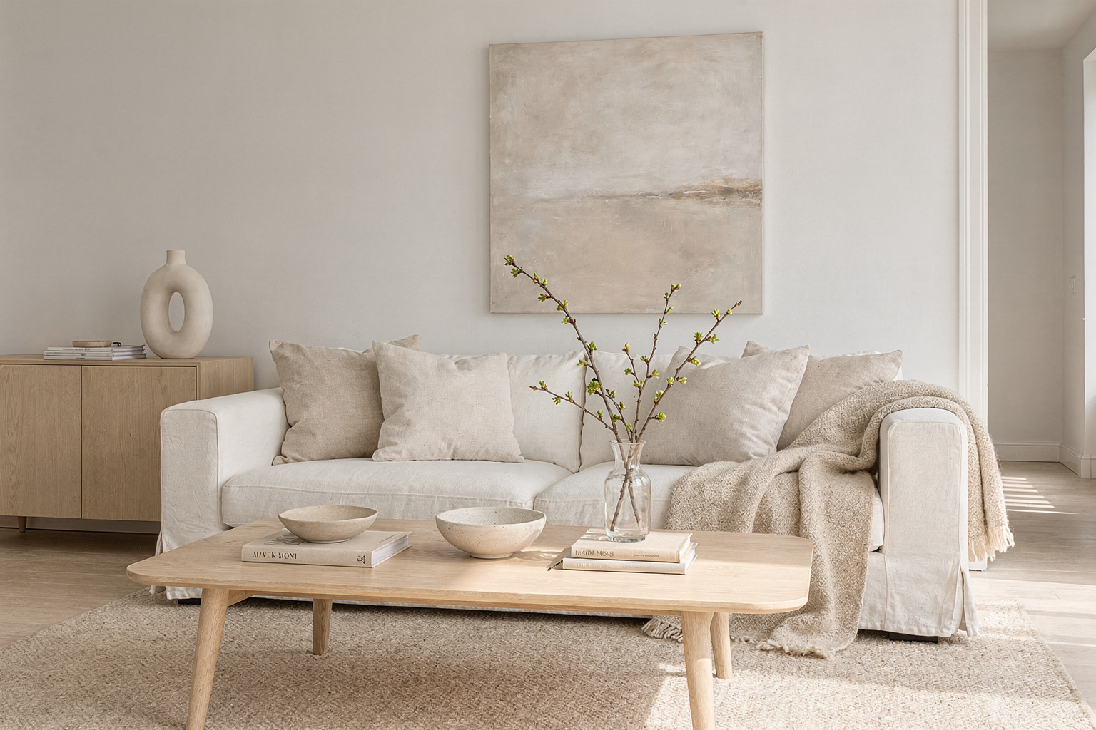
Soft Pastels: The Foundation of a Fresh Spring Mood
Start with soft, muted pastels as the backbone of your spring living room palette. Delicate shades like blush pink, pale mint green, and powdery blue create a soothing backdrop without overwhelming the senses. These colors work beautifully in upholstery pieces like a linen sofa or accent chairs, as well as in rug patterns or curtains. The softness feels fresh and calming but keeps the look elegant and grounded when paired with neutral walls—think warm whites, light beiges, or cream.
This approach works because pastels are easy on the eyes and reflect natural light, making rooms feel larger and airier. You can add texture through tactile layers—a boucle throw in a soft pink or a velvet mint cushion—to keep the softness interesting. Pastels also lend themselves well to mixing with natural materials like rattan or light wood, which balances femininity with an earthy vibe.
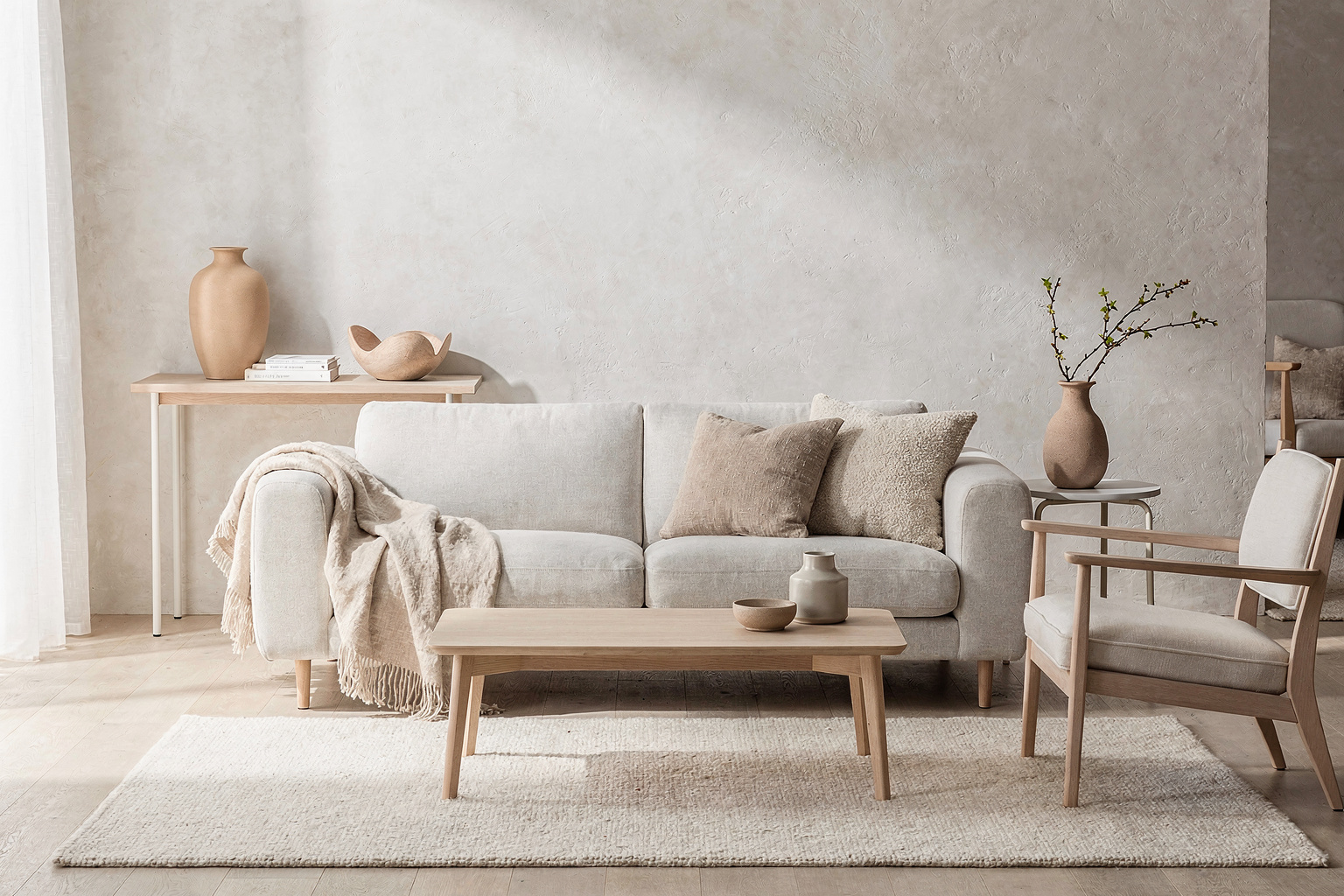
Terracotta and Botanical Greens: Adding Warmth and Life
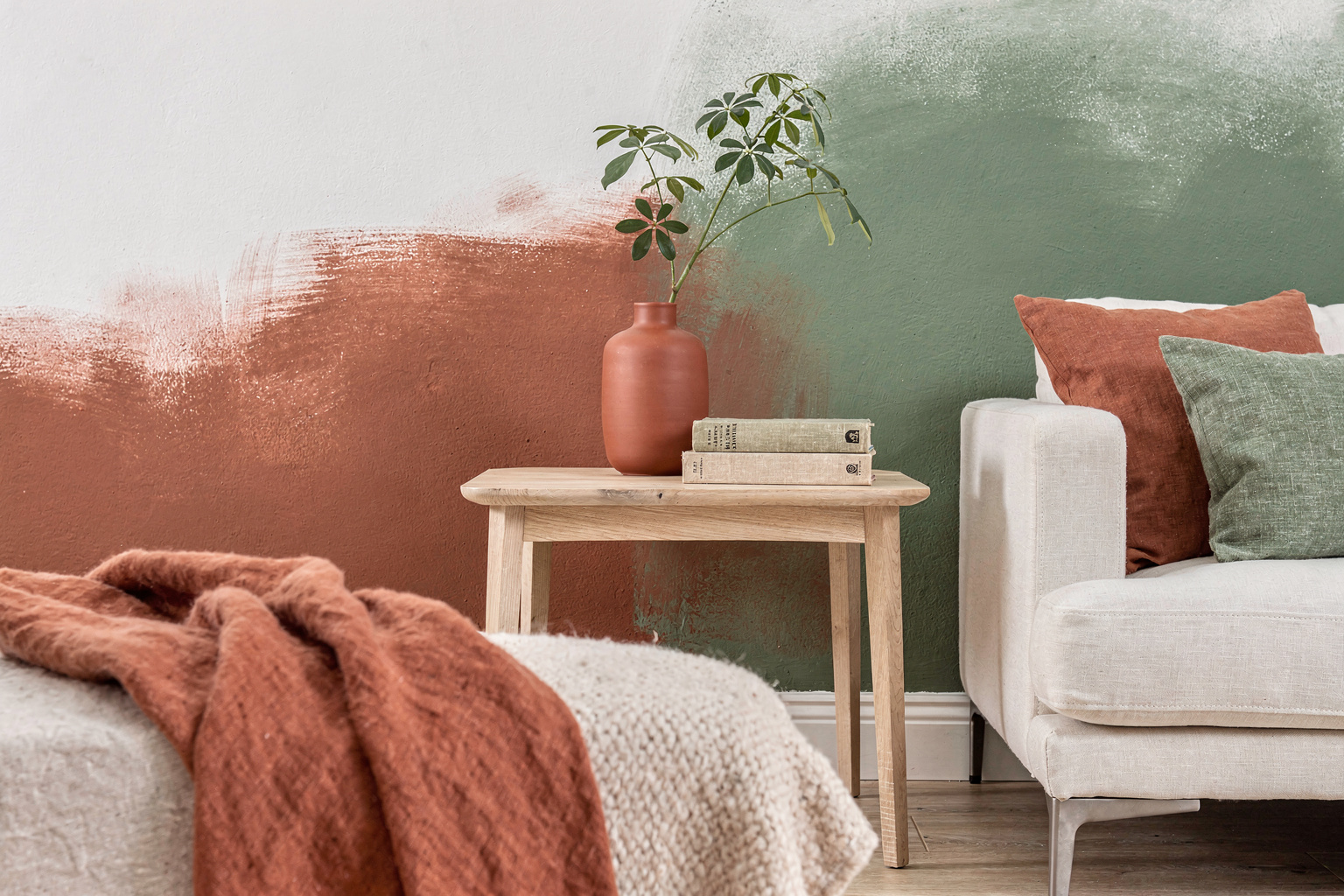
For a livelier take, inject warm terracotta and leafy botanical greens into your spring palette. Terracotta introduces a grounded warmth that feels very current right now, while fresh green tones echo spring’s outdoor renewal. Use terracotta on accessory pieces like ceramic vases or a statement side table. Botanical greens are perfect for throw pillows, plants, or even a textured accent wall.
This combination works visually because it pairs the warmth of sun-hued clay with the cooling vitality of green, creating a balanced contrast that is sophisticated but earthy. It invites a tactile experience too—think woven jute rugs or linen curtains that speak to natural textures, reinforcing the organic, restful vibe.
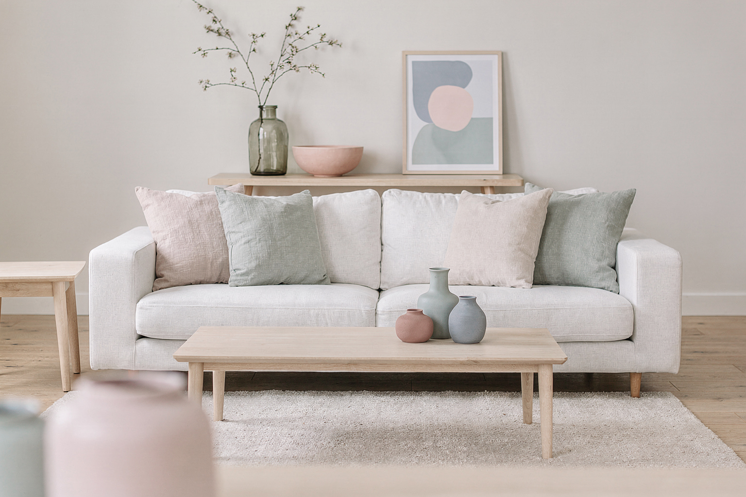
Layering Blues and Creamy Neutrals in Comfy Corners

Another spring-inspired palette focuses on soothing blues combined with creamy neutrals. These tones create calm, welcoming corners perfect for reading or relaxing. Imagine a cozy nook with a soft blue armchair, a cream knitted throw, and a natural wood side table. The muted blue adds depth without feeling cold or stark, while creamy neutrals warm the atmosphere.
This palette benefits from layered textures—mix cotton, wool, and wood—to introduce visual interest and tactile comfort. On walls, subtle gray-beige shades act as a versatile backdrop amplifying the blues and whites, while natural daylight softens the look to encourage a tranquil mood. This is ideal for homes seeking a quiet yet fresh spring update that feels classic and lived-in.
Bringing Cheer with Yellow and Crisp White Accents
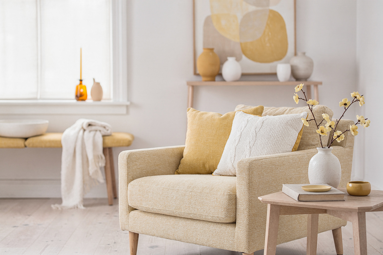
Yellow is the quintessential spring color to bring cheer and energy, but pairing it thoughtfully is key so it doesn’t overwhelm. Crisp white mixed with soft yellows creates a bright yet balanced look ideal for lively, sunlit living rooms. Consider yellow throw pillows, ceramic pieces, or light fixtures combined with white linen curtains and off-white sofas.
The sharpness of white sharpens yellow’s vibrancy, keeping it modern and fresh rather than cloying. Integrate soft gray cushions or wood tones to moderate the brightness and provide grounding contrast. This palette works well in homes with ample light, where the freshness can really shine, or smaller spaces where you want to create the illusion of openness and vitality.
Editing Your Palette for a Balanced, Lived-In Look
The final step in successful spring living room styling color palette work often comes down to editing. Layering colors and textures thoughtfully ensures a room feels composed yet relaxed—not forced. Choose a dominant color and one or two accent hues to carry through furnishings, textiles, and accessories. Aim for contrast in both color and material—pair matte with shiny, soft with structured—to maintain visual balance and tactility.
Simple habits, like rotating cushions or switching up seasonal decor pieces, keep the look fresh without a full overhaul. Start small, perhaps with a new rug or a collection of spring-hued ceramics, and let the space evolve naturally. This deliberate restraint helps avoid common spring living room styling mistakes like over-cluttering or mismatched palettes, which can confuse the mood.
For more inspiration on refreshing your home for the season, see our seasonal refresh guide on Spring Living Room Styling Ideas: Embrace Fresh Minimalism with Natural Touches.
FAQ
What colors are best for a small spring living room?
Soft pastels and creamy neutrals work best in compact spaces because they reflect light and create the illusion of openness, making your room feel airier and more inviting.
How do I avoid a palette that feels too cold or sterile for spring?
Balance cooler tones like blues or pastels with warm textures—think natural wood, terracotta, or soft woven fabrics. Adding plants also brings life and warmth.
Can I mix multiple accent colors in a spring palette?
Yes, but keep one color dominant and use others in small doses to avoid visual chaos. Layer textures and keep finishes consistent to unify the look.
How often should I update my spring colors?
Seasonal accents like pillows, throws, and accessories can be swapped out each spring while larger pieces can be more timeless to save budget and effort.
What are common mistakes in spring living room color styling?
Overloading bright colors without balancing neutrals, ignoring natural light’s effect on colors, or neglecting texture and layering can all disrupt the fresh, balanced feel you want.
Refreshing your living room’s color palette this spring is a chance to rethink how your space feels daily: brighter but cozy, lively yet restful. Whether you start with soft pastels or warm terracotta and green accents, focus on thoughtful layerings—colors, textures, and materials—that play off your room’s light and layout. Try updating accessories first to test how a new palette feels. This approach keeps your spring refresh manageable and rewarding, helping your home transition into the season with a quietly composed, naturally uplifting vibe.
Read Next
- Spring Living Room Styling Ideas: Embrace Fresh Minimalism with Natural Touches — Covers a nearby subtopic that expands the same topic naturally.