
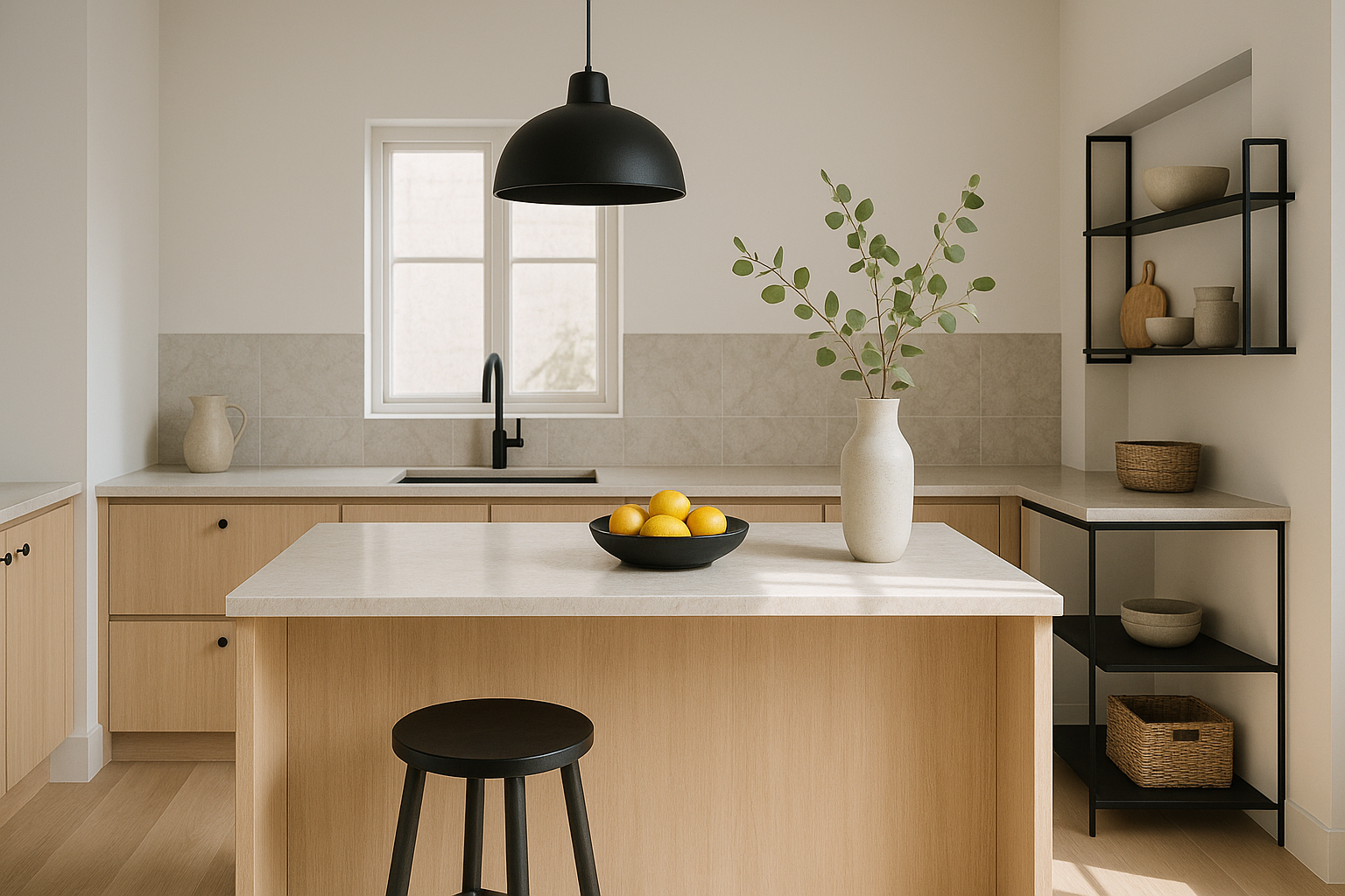
Kitchens are the heart of most homes, and the surface styling there matters more than many realize. A beautifully styled kitchen surface can invite warmth and function, reflecting a home’s personality while supporting everyday life. Yet, this delicate balance often goes wrong, especially when there’s a tendency to either over-clutter or under-style. Without smart editing, the kitchen counters can quickly feel chaotic, uneasy, or strangely barren—disrupting both the look and flow.
Understanding common kitchen surface styling mistakes helps you identify what to avoid and how to create surfaces that look thoughtfully composed yet lived-in. From managing clutter to coordinating colors and materials, this approach prioritizes natural daylight, texture layering, and proportion for a versatile, easy-to-update kitchen.
Overcrowding with Too Many Small Items
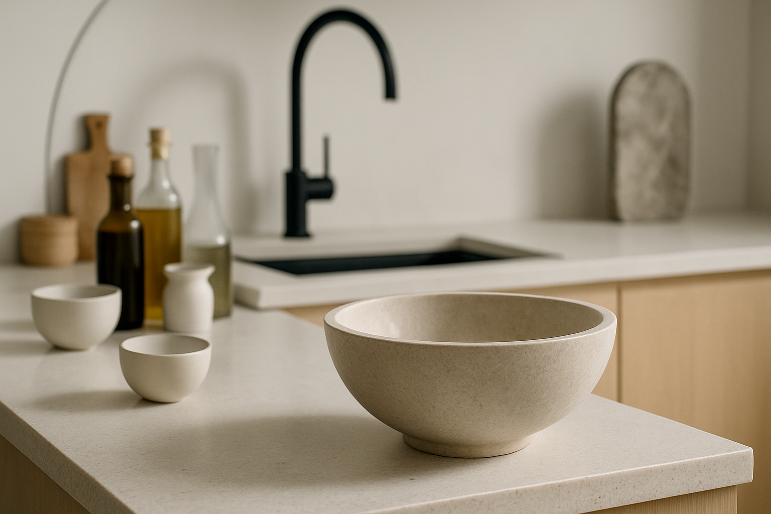
One of the most frequent mistakes in kitchen surface styling is overcrowding the countertops with numerous small, unrelated items. This creates visual noise that’s hard on the eyes and disrupts the natural flow needed in a kitchen workspace. Piles of spices, random utensils, decorative jars, and miscellaneous trinkets often compete for attention, making the space feel cluttered rather than curated.
The fix is to embrace restraint. Choose just a handful of items that you use daily and have some aesthetic appeal—think a ceramic utensil holder, a small bowl with fresh lemons, or a pretty wooden cutting board leaning casually against the backsplash. By intentionally limiting these pieces, you foster breathing room and clarity. It also helps keep surfaces functional for cooking and cleaning.
A useful layering technique is to combine contrasting materials—like raw wood against polished stone or ceramic—to add visual interest without chaos. Neutral palettes punctuated with a pop of color, such as mint green or terracotta, can create refreshing focal points that feel calm and thoughtful.
Forgetting to Coordinate Surface Decor with Cabinets and Walls
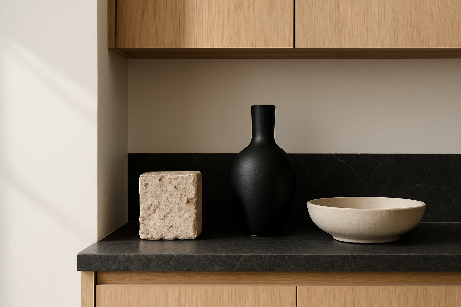
Another subtle but impactful styling error stems from ignoring the relationship between surface decor and the surrounding cabinetry or wall colors. When countertop items clash harshly with the kitchen’s overall color scheme, the surface looks disconnected rather than harmonious.
For instance, bright plastic containers in a kitchen with soft gray cabinets and natural wood accents can feel jarringly out of place. Instead, aim to select surface accents that echo or complement dominant hues rather than competing with them. Warm metals like brass or matte black in accessories can unify eclectic kitchens by bridging color gaps.
Matching textures also help tie everything together. If your cabinets shine with a lacquer finish, matte ceramics and natural linen towels provide contrast and tactile layering without competing. This technique creates a deliberate visual rhythm that helps surfaces blend with the room’s broader character.
Skimping on Textural Layers and Natural Elements
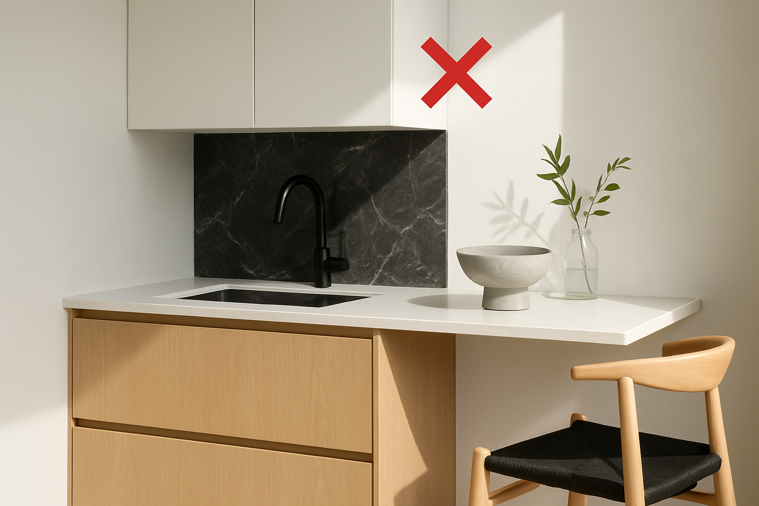
Under-styling is as much a mistake as overdoing it. Plain, sterile kitchen surfaces tend to feel unwelcoming and lack personality. A bare counter of just stone or laminate can make a kitchen feel cold and unfinished.
The solution lies in adding layered texture with thoughtful accessories that don’t crowd the space. Incorporate natural elements such as a small potted herb, a linen tea towel, or a woven basket for fruit. These warmth-giving touches engage both sight and touch.
Textural layering works visually because it prevents surfaces from looking flat, inviting the eye to rest on different materials and shapes. As a bonus, these layers are easy to swap seasonally—switch linen towels for cotton in summer or add dried eucalyptus in winter—keeping the styling flexible without total overhauls.
Overlooking Scale and Proportion on Kitchen Surfaces
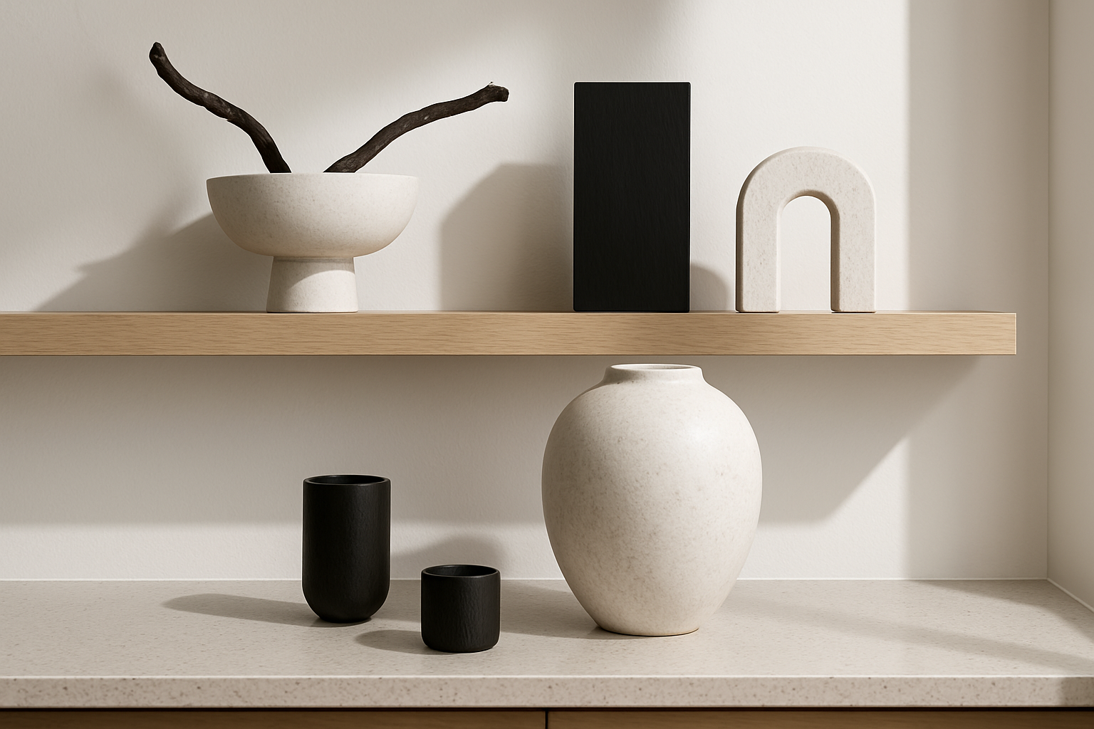
A surprisingly common but fixable misstep is ignoring scale and proportion in kitchen surface styling. Oversized pieces, such as large decorative jars or tall lamps, can overwhelm small countertops and intrude on workspace. Conversely, tiny items lost in a large kitchen feel insignificant and under-thought.
Choosing decor that fits your kitchen’s scale is essential. For compact kitchens, lean on low-profile trays or modest ceramic bowls. Larger kitchens can handle a statement wooden mortar and pestle or a couple of sizeable woven baskets without feeling crowded.
Visual balance here is key. Keep heavier items grouped near the corner to anchor the composition, with lighter, smaller pieces spaced to create flow. This avoids both clutter and starkness, offering a natural rhythm that feels intentional and comfortable.
Neglecting How Light Interacts with Surface Styling
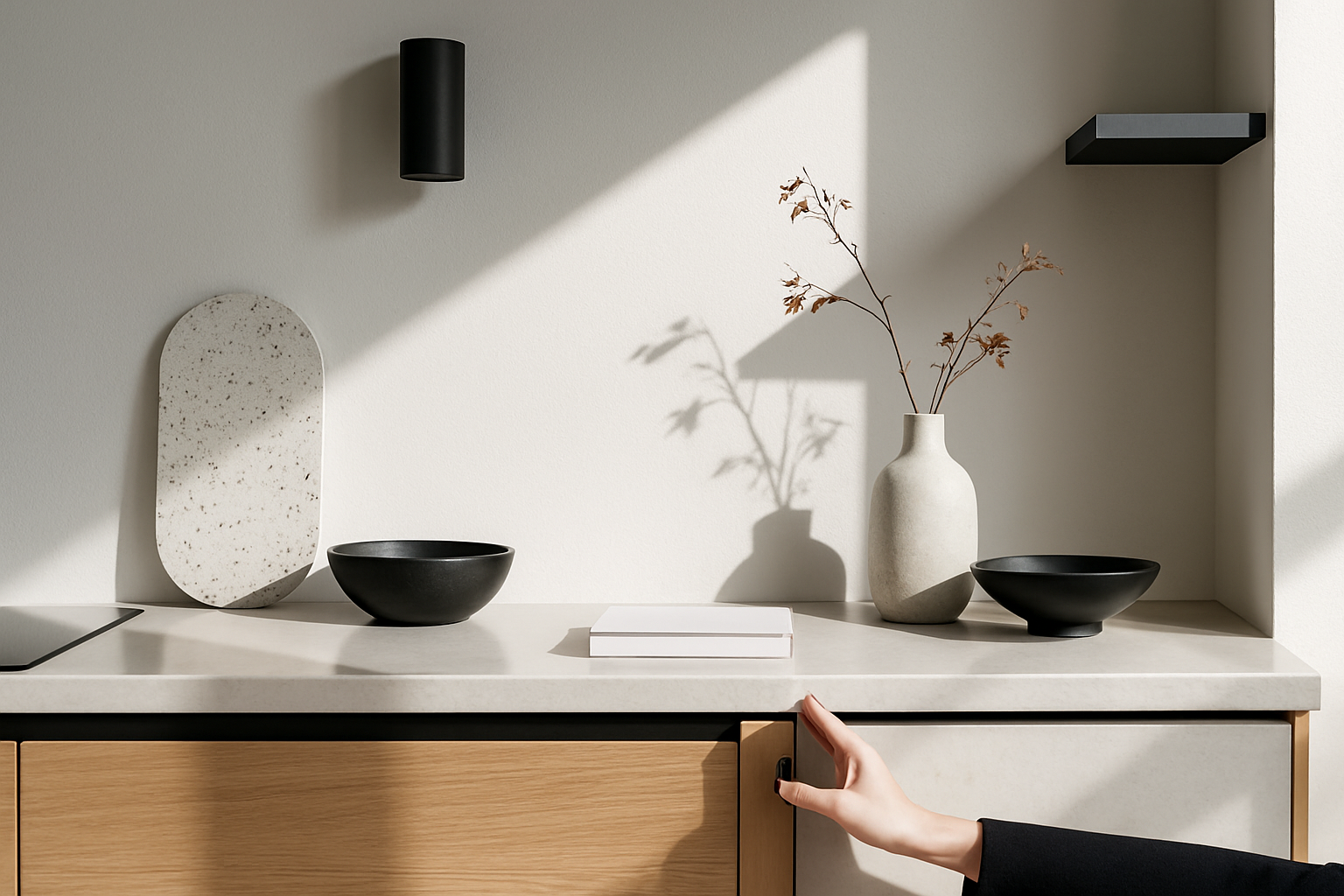
Finally, a less obvious but transformative styling mistake is overlooking the impact of natural and artificial light on kitchen surfaces. Poorly considered lighting can make beautiful materials look flat or harsh and diminish the appeal of carefully chosen accents.
To correct this, arrange decor to enhance light flow rather than block it. Avoid tall, dense displays that cast shadows on work areas or hide reflective surfaces. Transparent or semi-translucent items—like glass vases or open-weave baskets—help soften light and add openness.
In kitchens with less natural daylight, introduce light-toned accents or reflective materials like white ceramic or polished metal to boost brightness. Warm undertones in wood or textiles add softness to cooler light, making the space feel cozy without sacrificing clarity.
Frequently Asked Questions
How can I keep kitchen surfaces functional while styling?
Focus on styling only what you use daily and keep enough clear workspace. Choose multi-purpose pieces that serve both aesthetics and function.
What colors work best for cohesive kitchen surface styling?
Neutral bases with accents of warm ceramics, natural wood, or soft greens and blues typically create a calm, cohesive palette.
How often should I update kitchen surface styling?
Seasonal updates every few months with small changes like textiles or fresh greenery keep surfaces feeling fresh and prevent over-styling.
Can I mix styles on my kitchen surfaces?
Yes, but balance is crucial. Blend high and low pieces carefully, pairing textures and colors that complement your kitchen’s core style.
Conclusion
Styling kitchen surfaces thoughtfully is about striking balance—between function and beauty, restraint and warmth, scale and placement. Avoiding over-clutter and harsh color clashes, while layering texture and considering light, invites a lived-in feel that doesn’t look or feel forced. Start by clearing unnecessary items, then build gentle layers of natural materials that echo the room’s tones. This calm editorial approach not only helps kitchens feel more inviting but makes daily use smoother, keeping your surfaces a pleasure to live with and style anew.