Moody entryways offer a compelling first impression, anchoring your home with a sense of intimacy and sophistication. However, the trend’s signature dark hues and layered materials can easily tip into feeling either flat or overdone. At the heart of the problem? Texture choices that either fall short or compete too heavily, disrupting the delicate balance this style demands. Without thoughtful layering and scale, a moody entryway risks feeling cold or cluttered rather than inviting.
In this guide, we’ll explore common texture mistakes that frequently trip up moody entryways and practical solutions to restore warmth and interest. From uneven tactile mixes to proportion missteps, each section sharpens your eye so you can confidently create a space that feels both decadent and naturally lived-in.
Overly Smooth Surfaces That Flatten the Mood
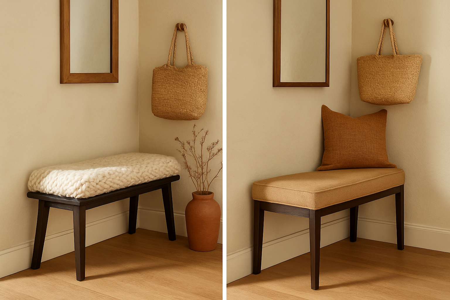
One frequent misstep is relying on smooth, flat finishes like polished plaster or slick painted walls and assuming the moody palette alone will add depth. While rich, dark colors set the tone, flat surfaces reflect little texture or visual movement, leaving the room feeling lifeless or stark instead of cozy.
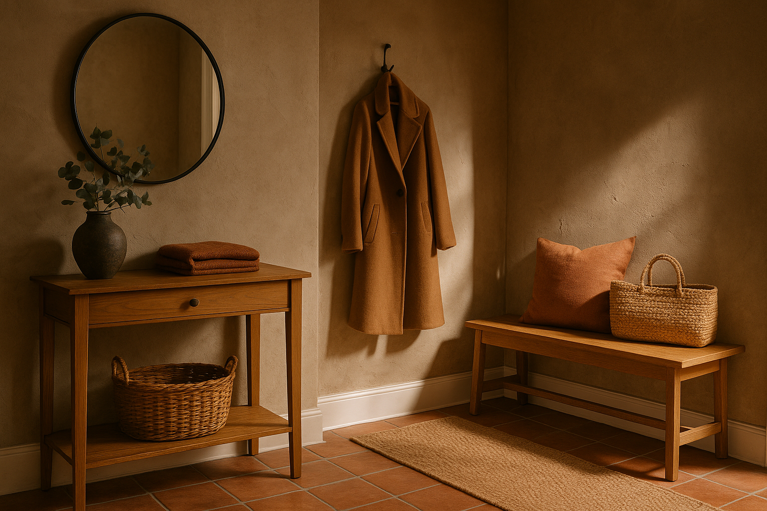
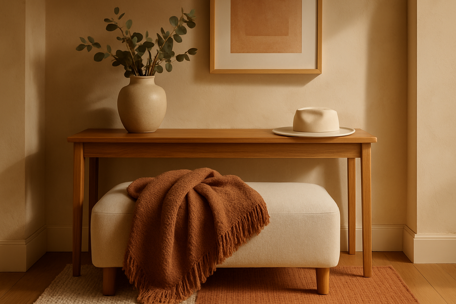
To fix this, introduce layers of tactile surfaces that contrast with the smoothness. Think a woven jute rug underfoot or a linen-upholstered bench to bring subtle texture that softens shadows and invites touch. Matte finishes on walls paired with rough-hewn wood or knotted baskets balance the sleek paint, playing with light and shadow for a richer visual story.
Using textiles with natural irregularities, such as a boucle throw or a sisal runner, complements moody paints without overwhelming. This approach breaks up the expanse and grounds the entryway, making it feel approachable rather than austere.
Mixing Textures Without Clear Contrast Can Feel Chaotic
Another texture trap is layering too many similar surfaces, particularly those that compete instead of complement. For example, mixing multiple coarse fabrics or several highly reflective materials can confuse the eye and create a disjointed atmosphere.
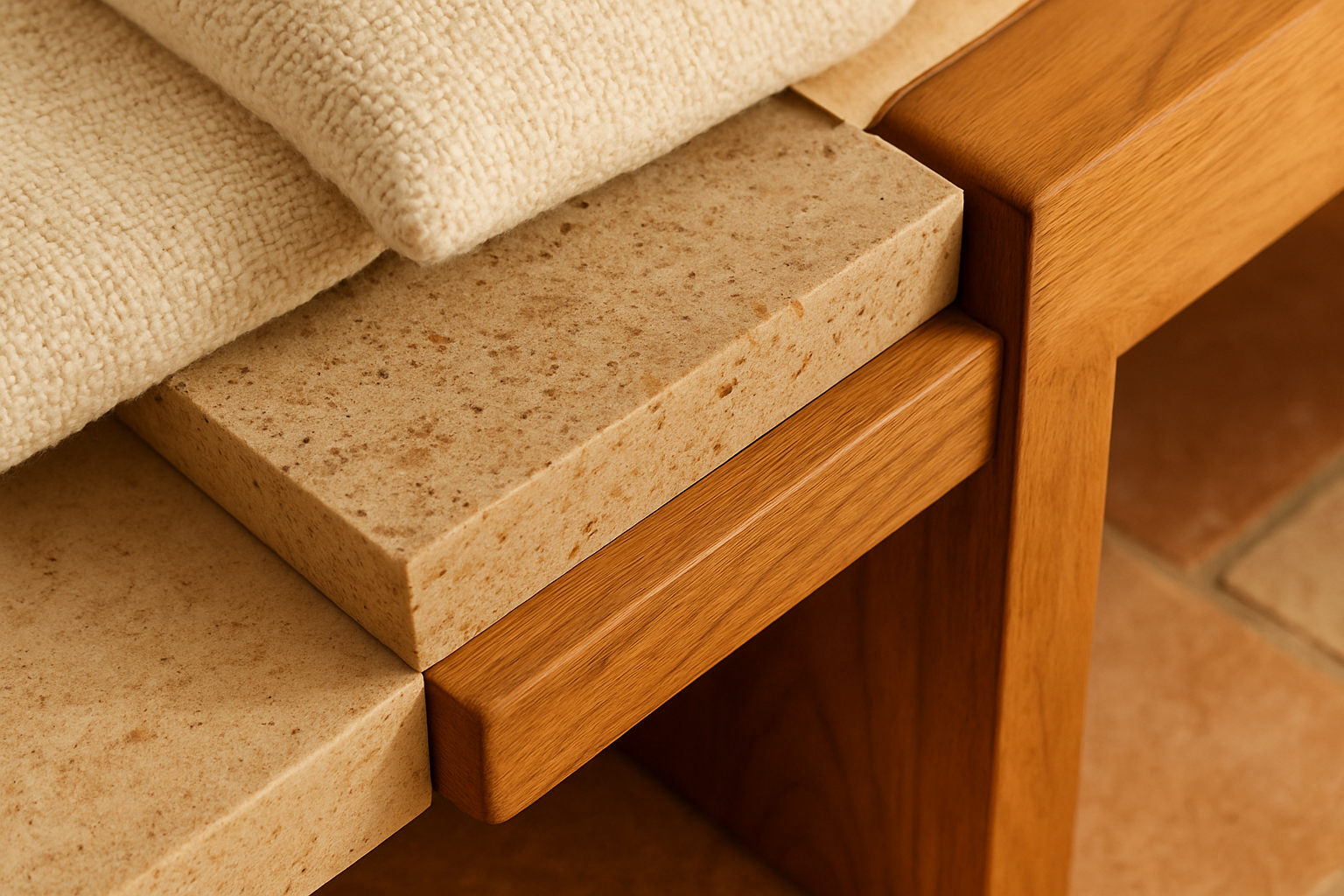
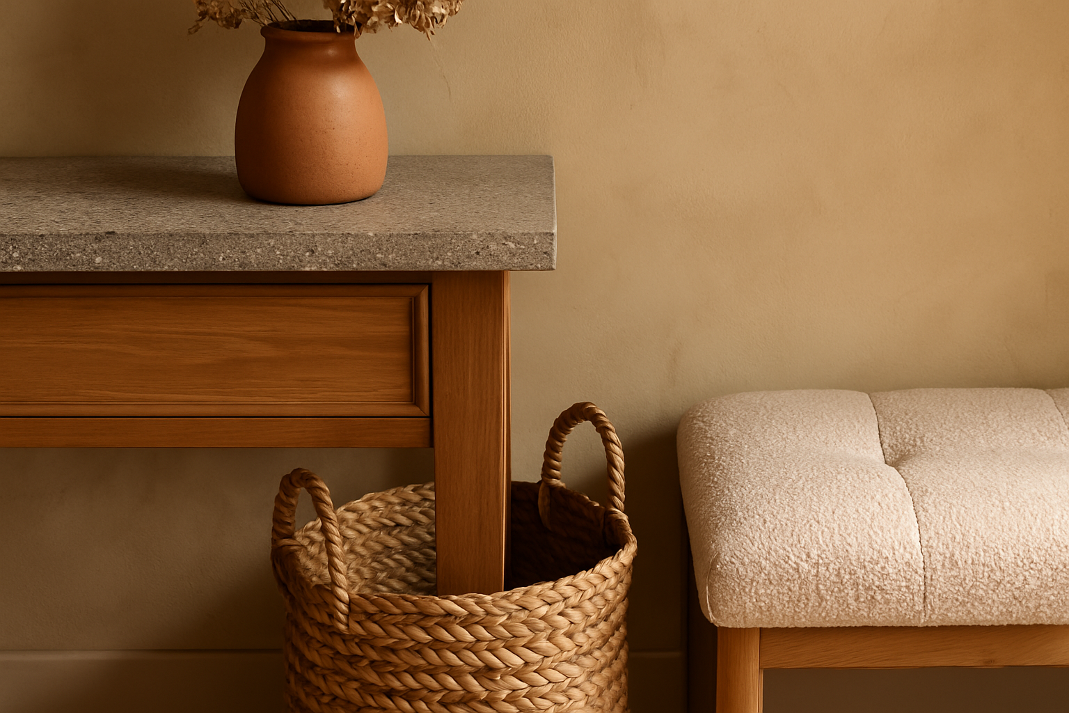
The solution hinges on thoughtful contrasts. Pair rough textures like a raw timber console with smooth matte ceramics or soft velvet cushions. The velvet’s plushness offsets the wood’s grainy edge, delivering a clear textural hierarchy that guides the eye smoothly around the space.
Your goal is to pick two or three textures that stand apart yet harmonize when combined. Limit shiny finishes in darker rooms where they may bounce unflattering light. Instead, integrate subtle sheens like a soft leather strap or muted metal hardware to punctuate layers with gentle highlights rather than visual noise.
Overlooking Cohesion When Selecting Texture Families
A subtle mistake is choosing textures from conflicting style families that fail to tell a coherent story. Pairing sleek stone tiles with ultra-rustic woven baskets and modern acrylic seating, for example, may pull the entryway in too many directions.
To maintain visual unity, anchor your textural choices within a consistent material story. If the mood is rustic-modern, textures like weathered wood, a hand-thrown ceramic bowl, and coarse linen work well together without clashing. For an industrial-flavored moody entry, mixing matte concrete with leather and matte black metal keeps the palette restrained yet inviting.
Selecting textures with a shared warmth or coolness also builds cohesion. For example, warm-toned natural fibers and wood accents resonate beautifully with warm moody paints like deep olives or rich sepias. This focus on harmony creates a well-edited feel instead of a patchwork of unrelated elements.
Getting Texture Proportions Wrong in a Small Entryway
Moody entryways often lean into larger-scale textures like oversized rugs or chunky knits, which can overwhelm compact spaces and disrupt flow. Taking this too far can make the room feel claustrophobic or visually heavy.
The fix here is scale awareness. In a small entry, opt for delicate-knit cushions or a medium-pile runner rather than an area rug with large, bold texture grids. Keep bigger, weightier textures for larger transition zones or halls.
Layer in focused tactile spots—like a sculptural wood coat rack or a pared-down woven basket that doesn’t crowd the floor space. This approach maintains interest and warmth while preserving necessary visual breathing room and clear pathways.
Forgetting Texture’s Role in Softening Lighting and Mood
Finally, texture is crucial for managing lighting effects in a moody entry, yet it’s sometimes overlooked. Without proper textural balance, even well-planned lighting can produce harsh shadows or flatness, impacting the room’s welcoming quality.
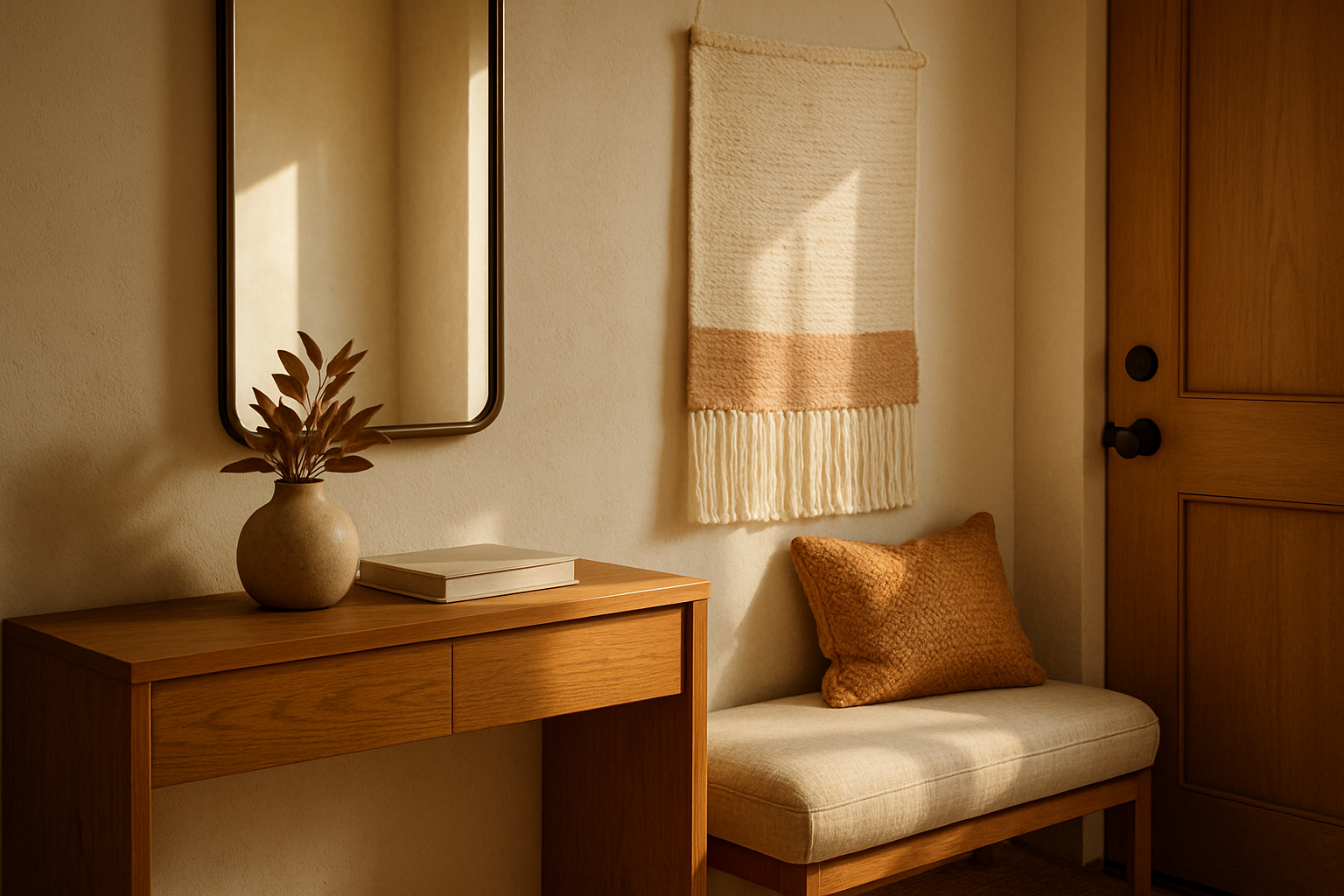
Correct this by adding textures that diffuse light thoughtfully. Sheer curtains, linen wall hangings, and even tactile wall panels soften strong rays and fill shadowed corners with gentle depth. Matte or softly textured lampshades also prevent glare, making the light feel warmer and more even.
Dark paints themselves absorb light, so incorporating varied finishes like a nubby wool rug or a handwoven basket allows light to bounce off surfaces in a controlled way, enhancing the room’s sense of calm and layered comfort.
Frequently Asked Questions
What’s the best way to layer textures in a moody entry without overcrowding?
Layer like a stylist by alternating texture types and scale—smooth with rough, matte with soft, small weave with chunky knit—while keeping the overall number of textures limited to three or four. This keeps the space rich without feeling busy.
Can I use too many dark textured materials in one entry?
Yes, using too many can create a visually heavy space. Balance is key: mix dark textures with lighter materials or subtle sheen to keep the atmosphere warm and airy.
How can I fix a moody entry that feels cold and uninviting?
Introduce softer textures such as wool rugs, linen throws, or woven wall hangings. Pair these with warm wood tones or subtle accent colors to add quiet warmth and tactile interest.
Is it okay to combine glossy textures with matte in a moody entry?
Glossy surfaces can work well if used sparingly and balanced with plenty of matte and soft textures. A high-gloss console or mirror can punctuate the space without overwhelming it.
What texture should I prioritize if my entry has little natural light?
Focus on soft, matte textures that bounce light softly—like cotton, linen, and lightly napped wool. Reflective materials can cause glare without natural light, so keep those minimal.
Conclusion
Moody entryways thrive on thoughtful texture layering that adds depth without tipping into flatness or clutter. Start by avoiding overly smooth surfaces that lack interest, then build contrast with clear textural pairings. Pay attention to texture families to keep cohesion, watch your scale especially in smaller spaces, and use materials that soften and bounce light subtly.
This isn’t about adding more stuff but about making every surface count, for an entry that feels quietly composed, layered, and welcoming every time you walk in. The first step is spotting which texture mistake your entryway leans on—and then making edits that bring balance and warmth back into the mix.